Creating a beautiful book is like crafting the perfect recipe—every detail matters, from the size of your canvas to the finishing flourishes. In this guide, we’ll walk you through all the details to help you get your project print-ready!
If you’re not sure about any of the print terminology used throughout, we’ve also got a glossary at the bottom to explain what they mean without all the jargon. For the ultimate shortcut to setting up a file from scratch, we've also got some handy templates you can download in various book sizes too.
🔍 Quick Overview: Print-Ready File Specifications
If you're a pro or simply looking for a refresher on our print file requirements, here are all the details you need for universal print files. For further information on each of these file requirements, continue reading the guide below.
- File format: PDF (Press Quality), layers/transparencies flattened and fonts embedded.
- Colour Mode: CMYK, with all black colours set to Rich Black.
- Image Resolution: 300 DPI minimum
- Logo Art format: Vector
- Bleed: 5mm
- Crop Marks: Enabled
- Suggested Margin: 10mm
- File Layout: Single page scrolling for all pages*
- *Cover Pages for PUR Perfect Binding: Bleed 5mm, supply as a separate PDF, with a spread layout that includes the spine.
- *Cover Pages for Hardcover Binding/Dust Jackets: Bleed 20mm, supply as a separate PDF, with a spread layout that includes the spine.
- Special Finishes: Supply each embellishment design as a separate vector layer exported as a PDF (or vector file for foil), unflattened, in 100% magenta as a spot colour with a unique name. Die cut lines should have a 5mm bleed, and fold lines must only be visible in the slug.
1. Software Options
Getting your project print-ready doesn't have to be overwhelming and the first step is making sure you're using the right software, as it'll often make the difference between a smooth printing experience and a frustrating one filled with rejected files and unexpected results. Below, we've compiled the most popular and recommended tools to help you create professional print-ready files, along with what to avoid, so you can confidently get your print file ready.
Recommended Programs
- Adobe InDesign
For professional book layouts, allows detailed control of all print elements. - Affinity Publisher
A budget-friendly alternative to Adobe InDesign, provides bleed support and CMYK export. - Adobe Illustrator or Photoshop
For book cover or dust jacket designs, vector artwork before inserting into an InDesign print file, image-heavy layouts. However, this software is not ideal for full publication layouts, as you'll need to manually increase your artboard size to include bleed, and crop marks may not be available depending on the version of software you are using. - Canva
Great for simpler designs and can export a PDF with bleed and crop marks, but bleed cannot be controlled and defaults to 3mm, and CMYK colour & high quality PDF export is only available on a Pro subscription.
Not Recommended
We don’t recommend using Microsoft Word, Excel, or PowerPoint to produce print-ready PDFs. These programs don’t support professional printing needs such as proper bleeds, CMYK colour mode, or embedded fonts. Even when exported as PDFs, files from these tools often shift layout or scale unexpectedly. They're fine for drafts, but not for the final print file.
2. Trim Size
Once you've got the software ready to create your new project or to migrate your content into, you’ll need to know the size of the book you’d like to print. This is also called the trim size. Setting the trim size is often the first thing you'll do no matter what software you use to prepare your print file. If you’re not sure of the dimensions or which trim size to pick for your project, we’ve got handy diagrams alongside the dimensions of various standard and popular book sizes for you below:
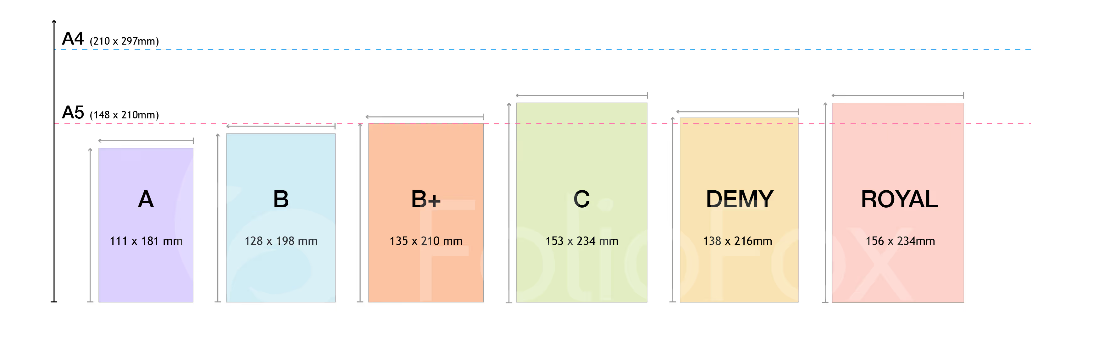
Publishing Industry Book Sizes
- A Format: 111 × 181 mm – Mass market paperbacks
- B Format: 128 × 198 mm – Standard novel size
- B Plus: 135 × 210 mm – Non-fiction and how-tos
- C Format: 153 × 234 mm – Trade paperbacks
- Demy: 138 × 216 mm – Traditional fiction/non-fiction
- Royal: 156 × 234 mm – Premium non-fiction, autobiography

International A Series Print Sizes
- A7: 74 × 105 mm – Mini notebooks and notepads
- A6: 105 × 148 mm – Pocket-sized
- A5: 148 × 210 mm – Journals, small books
- A4: 210 × 297 mm – Reports, manuals
- A3: 297 × 420 mm – Larger format, usually for posters or art books
- A2: 420 × 594 mm
- A1: 594 × 841 mm
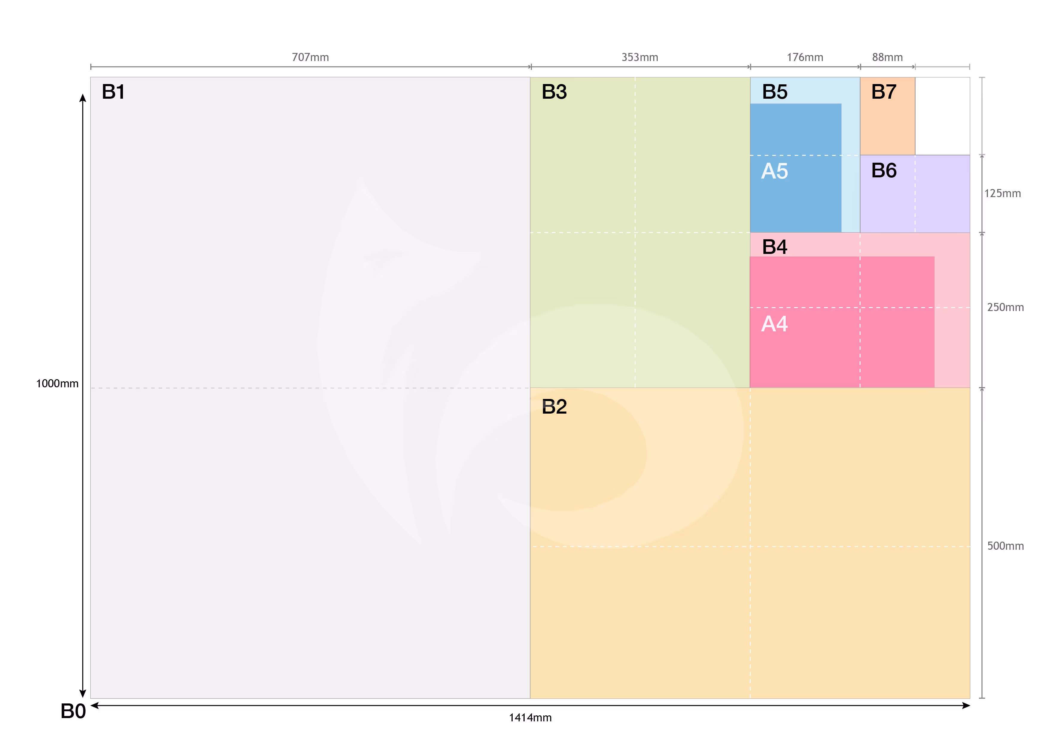
International B Series Print Sizes
- B7: 88 x 125 mm – Pocket-sized
- B6: 125 × 176 mm – Small books, travel guides
- B5: 176 × 250 mm – Trade paperbacks, journals
- B4: 250 × 353 mm – Art books, children’s books
- B3: 353 × 500 mm – Larger format, usually for display books or portfolios
- B2: 500 × 707 mm
- B1: 707 × 1000 mm
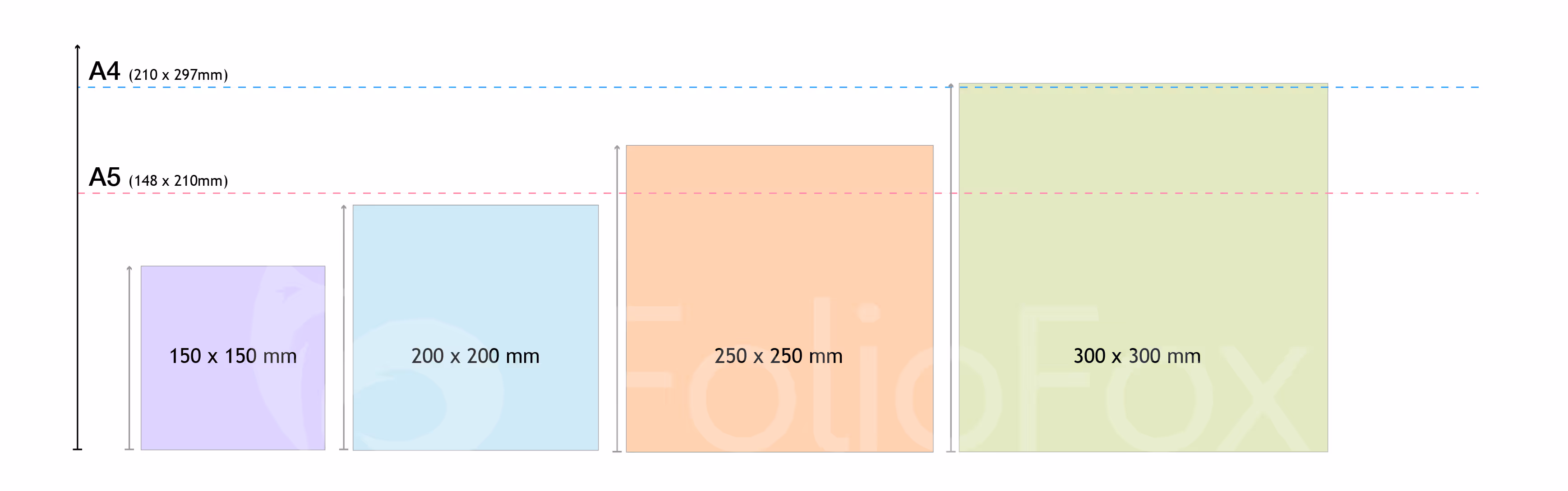
Popular Square Photobook Sizes
- 150 × 150 mm – Compact
- 200 × 200 mm – Versatile
- 250 × 250 mm – Generous
- 300 × 300 mm – Premium coffee table style
3. Configuring Your Print File
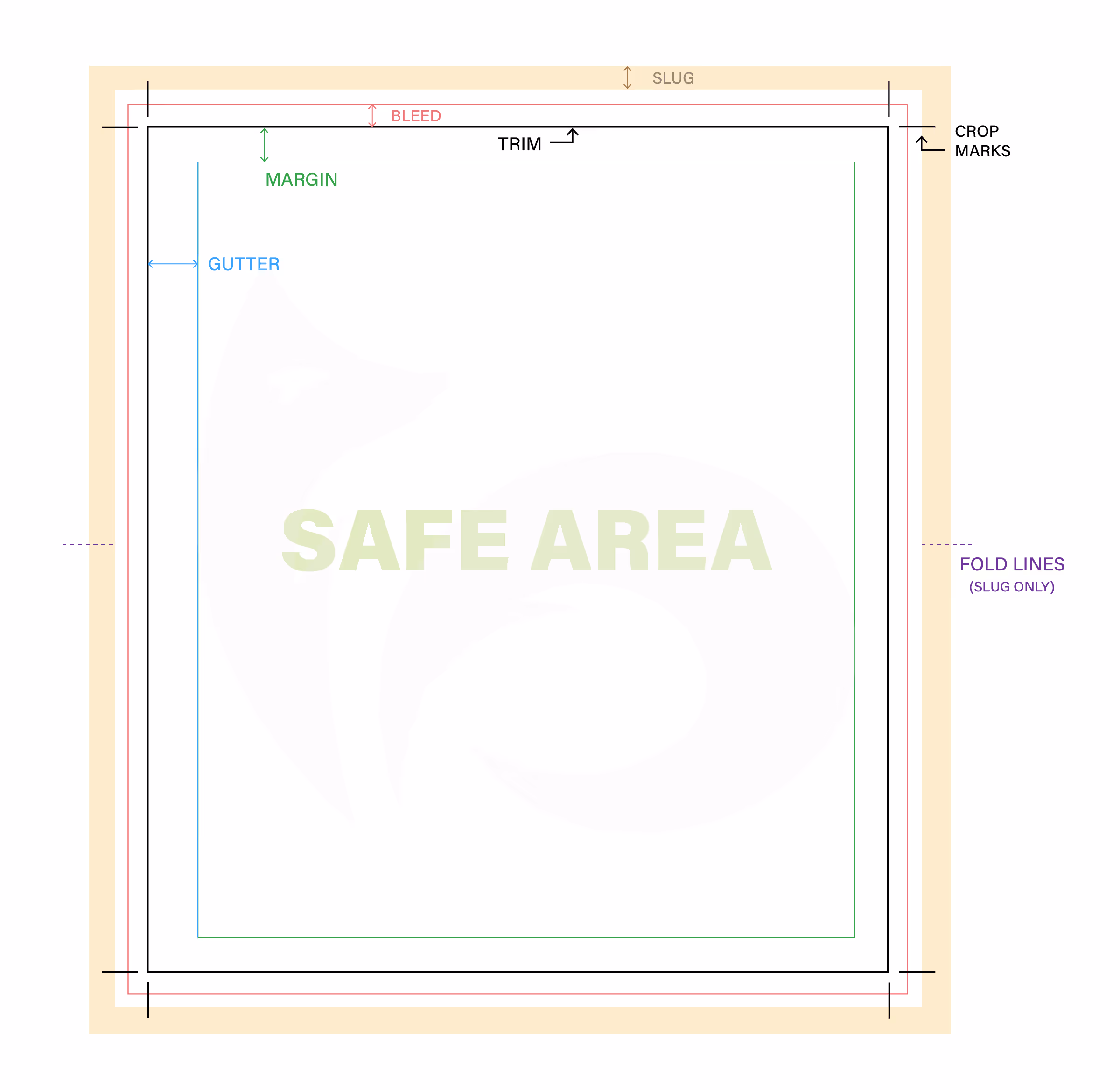
Once your trim size is picked, next you'll need to set up your file's colour mode, bleed and margins. To help you visualise what some of these print specifications are, we've put together a handy diagram to illustrate each component on a blank page for you below:
Colour Mode
If using InDesign, simply choosing a trim size from the 'For Print' section will set your colour mode to CMYK colours automatically, an essential requirement for printing, instead of RGB colours used for digital screens.
Rich Black
If your project uses the colour black, we always recommend making sure that it's set to Rich Black. This colour is not just 100% Black (C-0% M-0% Y-0% K-100%), but is achieved with C-30% M-30% Y-30% K-100%.
Bleed
Our recommended bleed size is 5mm, as it provides ample space to accurately trim your book no matter what machine is used to print it. Software like Canva only provide a bleed of 3mm, so you may need to choose a bigger custom trim size in order to have a 5mm bleed when exporting your file later on.
The only exception to this specification is for covers or dust jacket artwork for project that will be case bound (hardcover binding), as we recommend that these files use a 20mm bleed allowance for the best result!
Your bleed size should apply to all edges of the page, and you should make sure that any blocks of colour and images that need to be printed to the end of the page are extended all the way to the bleed line otherwise you may get an inconsistent border after trimming.
Margins
Important text and elements that shouldn't be cut off should stay within your safe zones, illustrated by margins. We recommend setting a margin of 10mm for all sides, minimum, for all binding methods (except hardcover binding) so that your important content isn't cut off or difficult to read after binding.
Hardcover binding is the exception, as the margins for text will greatly differ based on the number of pages in the book and the method of binding the pages together (PUR perfect bound or section-sewn) as the thicker the book is, the wider the gutter (binding edge margin) will need to be. Your account manager will be better able to let you know what the margin for your pages should be, to account for the binding type and thickness of your book.
4. Artwork Considerations
Once your print file is set up, the only thing missing is the content that you'll want printed! While keeping the bleed and margins in mind, you'll also want to consider a couple of additional elements to ensure a high quality print.
Images
Any kind of photo, illustration or image used in your print file should ideally have a resolution of 300 DPI minimum. This ensures that when your project is printed, that none of the images come out pixelated, blurry or inaccurate. If you're also using line art or text-based artwork, we also recommend an even higher resolution of 600 DPI but for all artwork, at least 300 DPI will produce a great print.
Logos
While your print file will eventually be turned into a PDF when exporting, you should make sure that any logo files you put in your file prior to export is a vector file. Similarly to image resolution, utilising a vector file means your logo will maintain its quality once it goes to print, with smooth lines and no annoying pixels (unlike raster files).
Spine Width
One of the most important considerations, if you are looking to print your book as a perfect bound paperback or a hardback, is the spine. This is not only the place that will hold all your pages together but a key component of what can make your book stand out on a shelf when others can’t see its cover. The amount of text and imagery like logos you’re able to fit on the spine is therefore dependent on how thick your book will be once it’s printed and bound. This is why it’s crucial to calculate your spine width as you’ll need to know how much room you have to finalise the design of your book cover, as this is printed in a spread that spans the front, spine and back cover.
We've got a handy spine width calculator that will instantly tell you your book's spine width in millimetres, where all you need to input is your book's total page count and select your preferred internal and cover paper stock from our paper range.
The width from this calculator is a guideline, as there may be other factors that increase or decrease the width of your spine (something your account manage will communicate with you if that is the case). That being said, a close guideline for an initial cover print file is better than a spine way off mark that could push back your turnaround time if you need to get the cover art file fixed.
If you’re not sure about the appropriate spine width for your book, reach out to get started on your project with us and your assigned print account manager can help you confirm those details and provide support at every step of the way!
5. Exporting Your Print File
If you're ready to get your project ready-to-print, the export process is where many other print specifications come into play.
PDF (Press Quality) File Format
All final artwork should be delivered as PDF files. Why PDF? It's like the diplomatic passport of the design world—universally accepted, preserves your formatting exactly as intended, and plays nicely with all printing equipment. PDFs lock in your fonts, maintain colour profiles, and prevent those heart-stopping moments when a file opens differently on someone else's computer.
In addition to exporting as a PDF, you should also opt to flatten all layers and transparencies, and embed all fonts used in the content. This prevents any unexpected changes during the printing process as all the various overlapping layers of your project combine into one, and the exact typeface you've used appears correctly (we don't want any random font substitutions or font stretching!).
There are different versions and types of PDF that are often not spoken about, so when using a professional layout software such as Adobe InDesign, you're able to choose which version to export as and our recommendation is always to choose 'PDF - Press Quality'. This type of PDF is set up to maintain the highest quality, as well as make sure that all the colours used are converted from RGB to CMYK, even if your file was set up to be in CMYK to begin with. If you usually incorporate Pantone (PMS) colours (when offset printing), then don't worry, those shouldn't be affected as we print in their CMYK equivalents.
Crop Marks & Bleed
While you may have had your bleed setup when configuring your file, you also need to make sure that the same bleed allowance is enabled when exporting your PDF, alongside crop marks. These will work to show exactly where the finished piece should be trimmed. These little lines outside your design area are like a roadmap for the finishing department, ensuring your piece gets cut exactly where you intended.
When you're setting this up during export, you might also notice that you can enable the slug, however, you shouldn't need to worry about this one unless your project has fold lines which should be visible in the slug after it's printed or as advised by your dedicated printing account manager.
Page Layout
Something that may seem simple but is often overlooked, is how to layout your pages in your PDF file so that it’s print ready! Especially given that regardless of what binding method will be used to bring your printed book together, we recommend that your pages are set to single scrolling. That means that the pages are not side by side, but individual and scrolling downwards in chronological order.
This also includes the cover, with the only exception being if your book will be perfect bound or casebound (hardcover), as these books require a separate PDF file for the cover in a spread layout. A spread layout has the pages next to each other, with the spine in-between, to look exactly like it would when wrapped around the block of internal pages. There may be other exceptions as well, especially if you’re creating a custom book, however, your assigned account manager will be there to direct you on what configurations are needed for a great print.
6. Specifications for Special Finishes
Special finishes and embellishments are a gorgeous way to help make your book stand out, but unfortunately do tack on a little extra time when it comes to preparing all the relevant files to go to print. In most cases, it’s not as difficult as it seems, especially if you’re working with a print or graphic designer.
Layered Finishes and Embellishments (Spot UV, Foil, Emboss, Deboss)
The most common book finishes like lamination and UV coatings are usually applied to the entire cover, but many premium finishes are only apply to small sections of the cover, which is why we require a separate PDF press-quality file for each additional finishing layer the cover will receive. This includes finishes such as Spot UV, foil stamping, embossing and debossing.
These additional files are what our print experts and machines use to precisely know where to apply the finishing layers before it can be bound. This is also why this additional file should only include the areas, usually a vector shape, logo, or outlined text, that you’d like the effect applied to as a separate layer. Most additional finishing files will need to be in a press quality PDF format, except for foil stamping, where your file should be vector.
Last but not least, all elements for the chosen embellishments need to be differentiated from the standard CMYK colours used to print your book, therefore we request that all elements in this separate file are set as a spot colour (a new colour swatch), with a unique descriptive name (such as “foil stamping” or “spot uv”) and that its colour should be in 100% magenta (C-0% M-100% Y-0% K-0%). Some printers request that the spot colour be black, but we prefer magenta. Once you’ve exported the PDF or finalised the vector file for finishing, you’re ready to roll.
Die Cutting Finishes
For custom projects that go the extra mile with die cutting, all the die cutting lines should be treated like an embellishment with its own separate vector layer and exported PDF file, but also have 5mm bleed around the lines to make sure there are no gaps or borders.
Folds and Flaps
If your project will have flaps or folded sections, you don’t want to have the guidelines for folding on the artwork itself (that probably won’t look too great!), so instead, you add these fold guidelines to the slug. This is the area outside of the bleed line in your main artwork document so you don’t need a separate file for this finishing technique. It can be whatever you choose as well, as your book page will be folded before they are cut to trim size. Make sure to export with both bleed and slug enabled so that your final file has the folding guidelines and any other printing instructions you might need in your PDF file.
7. Glossary & Templates
We’ve covered a lot in this guide to provide you with a convenient and easy to follow blueprint for getting your project print-ready, but we also understand that this can be overwhelming and full of words you’ve never heard of before. To make things easier, we’ve also included a glossary of all the print-specific terms mentioned above, as well as some InDesign templates that are already set up correctly if you’re looking for a shortcut or haven’t used this software before.
As always, if you’ve got any questions, get in touch and one of our friendly print experts will be in touch to help!
Binding Edge
The side of the page where the binding will be applied. Using the recommended gutter/inside margin will make sure that any content is kept clear of this area depending on the binding method, so it’s not lost in the spine.
Bleed
The extra area of artwork around the page that extends beyond the final trim size, and should ideally be set to 5mm. This ensures no white borders appear after cutting and accounts for slight variations in the trimming process.
CMYK
The four ink colours used in commercial printing: Cyan, Magenta, Yellow, and Key (black). Always convert your artwork to CMYK colour mode for accurate printing results.
Creep
This is what happens when the inner pages of a book, typically saddle-stitched, extend slightly beyond the outer pages. This effect occurs when pages are folded and nested during the binding process, and the inner sheets “creep” out past the outer sheets, which can affect the content layout and alignment.
Depending on the weight of paper chosen, saddle-stitched books with over 24 pages will likely need to be adjusted for creep through a process called shingling (or feathering) that all printers undertake when preparing a file to print during the prepress process.
The page content is gradually shifted inwards, the closer it gets to the centre of the book but this shouldn’t affect your content unless you have important elements close to the edge of a page that fall outside the recommended bleed and margin allowance.
Crop Marks
The small lines placed at the corners of your artwork as a guide for where to trim. This should be enabled for all files going to print.
Resolution / DPI
Resolution is the generic way to describe the quality of a visual component; similar to how you’d measure video as 1080p or 4K for a video, but in print, we use DPI (Dots Per Inch). Commercial printing requires 300 DPI minimum for sharp, professional results. Not all images will have a high enough resolution so that it’ll translate to a high quality print, and the DPI is a setting you can control while exporting your files to make sure your project prints well.
Font Embedding
Ensures your chosen fonts stay exactly as designed, regardless of what fonts are installed on our printing systems. When exporting to PDF, make sure font embedding is selected in the export settings (usually under “Advanced” or “Fonts”).
Embossing & Debossing
These are special finishes and embellishments, which creates raised areas on paper by pressing from underneath (Embossing) or recessed areas by pressing down from above (Debossing) for added texture and a premium look and feel.
Learn more about these finishes here.
File Flattening
Converting all layers, effects, and transparency in a design file into a single, printable layer. This prevents unexpected changes during the printing process. In Adobe tools, this can be done during export—look for “flatten transparency” or “rasterize effects”.
Gutter
The inner margin near the spine. Important for bound books, especially perfect and hardcover, where some content can disappear into the fold.
Leading Edge
The edge of the page that feeds first into the printer or trimmer.
Margin
The gap or allowance you should give between your content and the trim line, also known as the safe area. We generally recommend a 10mm margin on all sides for most projects, and 20mm for cover artwork if the book will be case-bound (hardcover) or for dust jackets. This ensures that all the important text, photos and logos aren’t accidentally cut off or maintains a consistent page layout throughout the book.
Pantone (PMS)
This is the Pantone Matching System—a standardised colour system used globally by commercial printers and brands for offset printing consistent, specific colours regardless of the printer or material used. These colours don’t use CMYK but their own unique formulas, which can be patented by brands such as the Coca-Cola Red and Cadbury purple. When digital printing, these colours are reformulated to be in CMYK, as the original PMS colours are for offset printing only.
Raster
This is used to describe images made up of coloured pixels, like photos, and can be spotted by their file type (such as .jpeg/.jpg, .png., .gif, .psd, .tiff, .webp). Raster images can lose quality when enlarged if their resolution isn’t high enough, this is why we require 300 DPI minimum to avoid any images printing out as pixelated or grainy. Adobe Photoshop is a program that works with Raster images, compared to Adobe Illustrator which typically works with vector images.
RGB
This is the Red, Green, Blue colour mode used for screens and digital displays. Anything to be printed must be converted to CMYK or a Pantone (PMS) colour, or it simply won’t look the same printed as it does when designing it on your screen.
Rich Black
A darker, more saturated “true” black when printed on paper, that is higher quality and produces a much nicer print. It’s created by setting the CMY colours at 30% and K at 100% (C30 M30 Y30 K100), rather than 100% black ink alone (C0 M0 Y0 K100).
Slug
This is the available space outside the bleed area, which is often used for specific printer instructions such as file names, colour swatches, and fold lines. If you need to add in any instructions, make sure to set up your file to include a slug.
Spine Width
The thickness of your book's spine, calculated by: (Number of interior pages ÷ 2) × paper thickness + cover paper thickness. This is essential for designing covers that fit properly around the interior pages.
Trim Size
The final or finish size of your printed piece after it has been trimmed/cut. This should reflect the dimensions of the book size you’ve picked out, no bigger or smaller.
Vector
The opposite of raster, in that these are graphics which can be enlarged or minimised without losing quality as they are created with mathematical equations (paths), instead of coloured pixels. Vector art maintains its crisp edges at any size and is ideal for logos, text and line art. PDFs can contain vector artwork, and any PDF going to print should make sure its logos are inserted as vector files (such as .ai, .eps, .svg). To check if your file is vector; simply zoom in—if it stays sharp, it’s vector, and if it starts to pixelate, it’s raster.
Templates
Set up your file with confidence with our Adobe InDesign print-ready templates, available in popular book sizes!
- A Series: A5, A4
- Publishing Sizes: B Format, C Format, Demy, Royal
- Perfect Bound Cover (spread with spine) : A5, A4, B Format, Demy, Royal
How to Access InDesign Templates
- Click on your preferred book size to download the .zip file to your computer.
- Unzip / Extract the file:
On Mac: double-click the.zipfile.
On Windows: right-click → Extract All… - Open the folder. Inside you’ll see:
- The InDesign document (.indd).
- A Links folder with all images.
- A Document Fonts folder (install these fonts if you don’t already have them). - Open the .indd file in Adobe InDesign to start working with the template.