
Building An Author Profile As A Business with Saara Milliken
July 15, 2026
The power of the perfect font in a printed publication should never be underestimated.
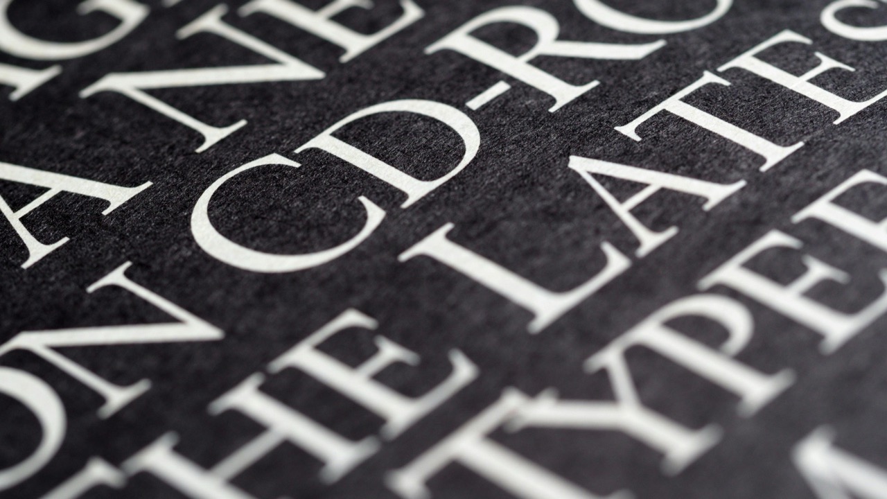
The power of the perfect font in a printed publication should never be underestimated. This secret weapon - also commonly referred to as typeface or typography - is an incredibly effective tool to help portray words’ meaning, tone and readability through the style in which the words appear on the page.
However, there is no one font that trumps them all. Different fonts are utilised depending on the type of printed publication in which the words appear. Let’s take a closer look at the role of fonts and the considerations to take into place when choosing which of Australia’s most popular fonts will work best for your project.
Before we delve into the vast world of fonts, let’s begin with a quick journey into the field of typography. Typography’s role is an extremely important one in creating a smooth, accessible and suitable reading experience of your text. While it may seem simple on the surface, typography actually holds a lot of power over your project - choosing the perfect font is subtle in its success, yet painfully obvious when it misses the mark.
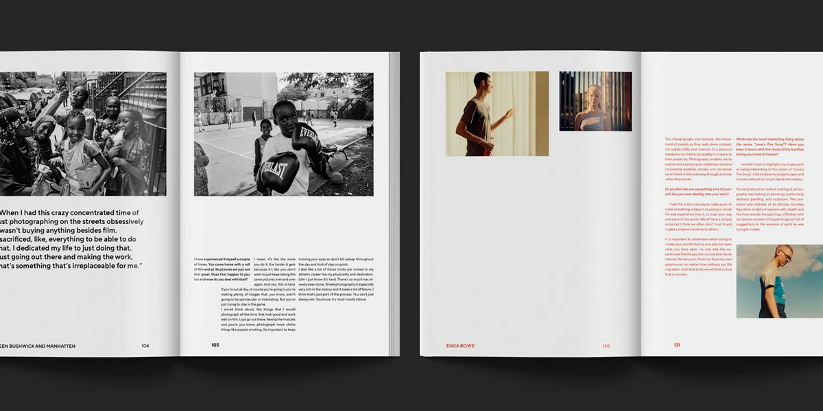
Typography doesn’t just refer to the fonts or typefaces in which your words appear - the art of typography also comes down to elements like visual hierarchy (the arrangement of elements to guide the viewer’s eye), tone, genre, readability and aesthetic flourishes. When it comes to printing a publication - whether that be a booklet, catalogue, marketing material or a self-published book - the primary goal of typography is to make the reading experience as easy and as pleasant as possible for your reader.
There is no right or wrong when it comes to choosing a font for your project, although some fonts have stood the test of time for good reason. The two main factors to consider in choosing a suitable font is readability - referring to the visual comfort a reader experiences - and being on message - referring to the tone, style or ideas your text is trying to convey.
As for popular fonts used in printing, the following serif typefaces are some of the regular go-to fonts for publishers Australia-wide:
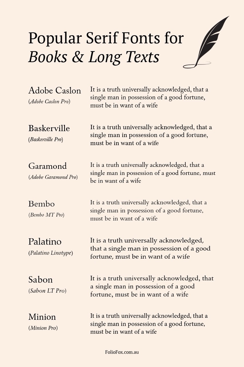
Caslon is a true book classic. First drawn in the 1700s, it has a warm, slightly old-world look that feels both timeless and welcoming. It’s easy on the eyes for long reads, which is why it’s been a favourite for novels for centuries.
Common versions: Adobe Caslon Pro, ITC Founders Caslon, LTC Caslon.
Baskerville brings a touch of elegance without being fussy. It was created in the 1750s and has a clean, refined appearance that makes pages feel crisp and sophisticated. Perfect for literary works or anything that needs a little polish.
Common versions: Baskerville Pro, ITC New Baskerville, Libre Baskerville, Baskerville MT.
Garamond is graceful and efficient—slightly narrower letters mean you can fit more words on a page while still keeping excellent readability. Its soft, classic character gives books a hint of old-world charm.
Common versions: Adobe Garamond, EB Garamond, Cormorant Garamond.
Bembo has a calm, balanced look that feels effortlessly classic. Originally inspired by Renaissance printing, it gives text a smooth flow that works beautifully for everything from poetry to history books.
Common versions: Bembo MT, Bembo Book MT Pro, Bembo Pro.
Palatino is friendly and versatile. Designed in the 1940s, it has slightly wider letters and generous spacing, making it easy to read even at smaller sizes. Great for novels, nonfiction, and anything where comfort is key. A more accessible alternative you’ll often find pre-installed on computers is Georgia, which offers a similar balance of readability and modern style—especially handy for authors working with digital-first publishing.
Common versions: Palatino Linotype, Palatino Nova, Book Antiqua
Sabon is a modern take on the classic Garamond style. It was designed to print consistently across different presses, so it’s very reliable while still looking elegant. A safe, stylish choice for almost any kind of book.
Common versions: Sabon LT Pro, Sabon Next.
Minion Pro is a contemporary favourite. Created in the 1990s, it blends traditional book typography with modern digital precision. It’s clean, balanced, and extremely versatile—ideal if you want a professional look without feeling old-fashioned.
Common versions: Minion Pro, Minion 3.
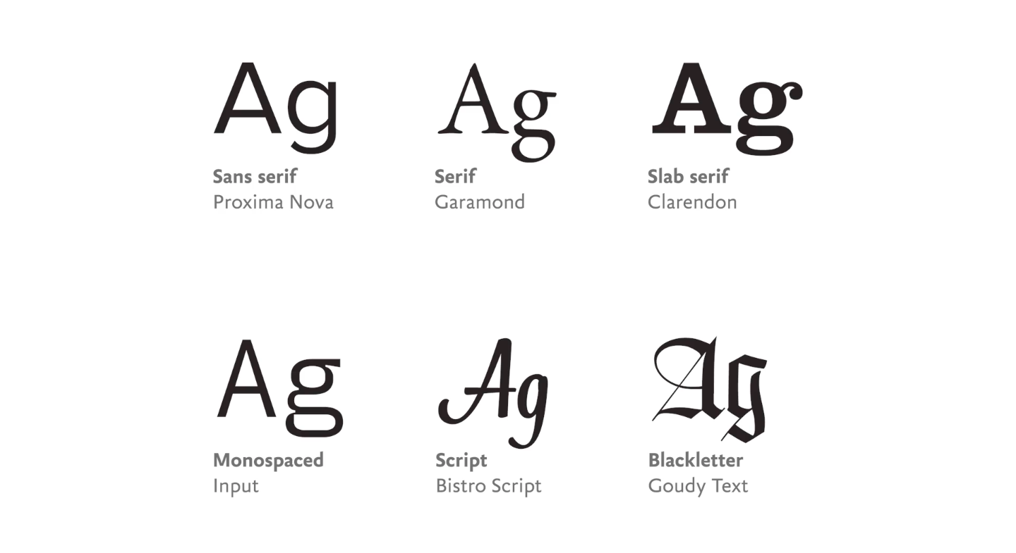
Serif fonts are most common for a book’s body text as they have greater readability, especially when the text size is smaller and in blocks of paragraphs. They are also commonly used to portray a traditional tone of voice, like in a newspaper or a book, due to their historical style.
Each of the listed typefaces above have been around for many years, a length of time which not only proves their longevity, but also means that they may have multiple variations of typeface families, hence the multiple names they may be known as. Many of the most popular fonts for book printing are not only ‘old-style’ serif fonts, but fonts also largely inspired by Garamond.
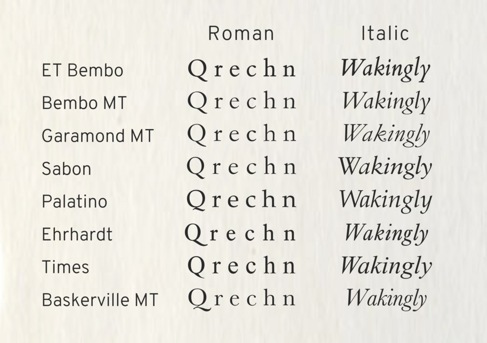
Named after its type designer Claude Garamond, this typeface isn’t just one font but was a historically defining moment in history and has inspired hundreds of new serif fonts looking to achieve the same elegance, versatility and readability. Adobe Garamond and EB Garamond are two of the most widely used digital recreations of the original font, and are two of many other fonts heavily inspired by the original. Bembo, Sabon, Caslon, Palatino etc, are likely the most popular fonts in book printing and publishing in Australia and worldwide as a result of being successful modern reinterpretations and great alternatives to the original Garamond and/or Adobe Garamond.
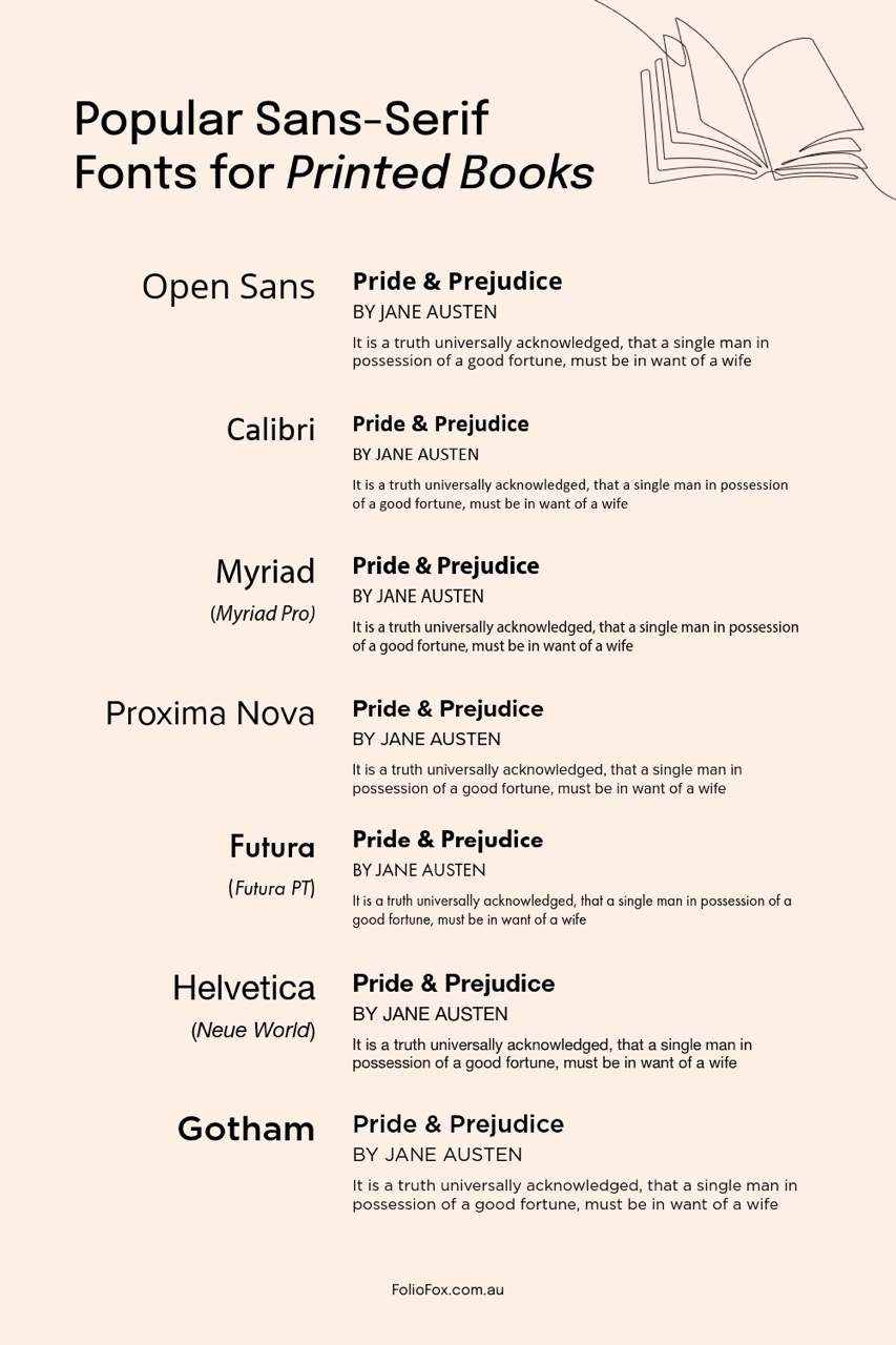
As for sans serif fonts, this type category isn’t traditionally used for body text, with some exceptions such as children’s books or some modern magazines or corporate annual reports where a sans-serif font fits the audience better. Generally, sans-serif fonts are great for headings, titles and large display texts, as they are clear to read and can add some flavour to your publication by contrasting against body text in a serif font.

Popular sans-serif fonts used in publishing and book printing in Australia include:
Open Sans is one of the most widely used free fonts today. It’s clean, neutral, and works across both print and digital, making it a safe bet if you want versatility without cost. Perfect for authors who want a dependable, approachable look. If you’re after something with a bit more personality for titles and headings, Raleway is a popular free alternative that pairs beautifully with Open Sans.
Common versions: Open Sans, Open Sans Condensed, Raleway.
Known as Microsoft Word’s default font for years, Calibri is simple, smooth, and very legible. While it’s not as distinctive as other typefaces, its soft, rounded shapes make it easy to read for workbooks, nonfiction, or any project where clarity comes first.
Common versions: Calibri, Calibri Light, Calibri Variable.
Myriad is warm and approachable with a subtle human touch, originally designed for easy reading in print and on screen. It’s great for nonfiction, memoirs, or any project that needs a friendly, open vibe without looking too casual.
Common versions: Myriad Pro, Myriad Variable.
Proxima Nova is a modern design favourite. It balances the geometric sharpness of fonts like Futura with the warmth of humanist sans serifs like Myriad. It’s widely used in publishing and online platforms, giving books a sleek, contemporary look. If you prefer something in a similar spirit but with a softer, timeless edge, Avenir (or the updated Avenir Next) is an excellent choice.
Common versions: Proxima Nova, Proxima Soft, Avenir, Avenir Next.
Futura is a geometric classic from the 1920s that still feels fresh and modern today. Its clean, circular shapes give books a sleek, contemporary edge while staying easy to read. Ideal for minimalist covers or crisp interior headings.
Common versions: Futura PT, Futura Std, Century Gothic (a similar free alternative).
The ultimate “neutral” typeface, Helvetica is clean, balanced, and universally recognisable. It works beautifully for straightforward layouts where you want the words to speak for themselves.
Common versions: Helvetica Neue, Helvetica Now.
Gotham is a contemporary classic that became famous for its bold, confident presence in political campaigns, corporate branding, and editorial design. It has a clean, modern authority that feels trustworthy and polished—but it comes with a hefty price tag for licensing. Metropolis is a fantastic free alternative to Gotham, offering that same strong, confident look without the licensing barrier. It’s an excellent choice for bold covers, headings, or projects that need modern impact on a budget.
Common versions: Gotham, Gotham Rounded; Metropolis Regular, Metropolis Bold.
Sans serif fonts are especially useful when paired with a serif font as the contrast helps in differentiating the body text from the headings and subheadings. Alternatively, sans serif fonts reflect a modern sleekness that works well when used in marketing material or professional content.
Classic fonts like Times New Roman or Arial that were popularised thanks to software like Microsoft Word, are commonly used for personal work, however some experts warn against using these common fonts for professional projects as they are not designed explicitly for printed publications and thus can appear amateurish.
Beyond the visual considerations to take into account when thinking about the most popular fonts when book printing and self-publishing, there are also a range of other criteria that can help you understand the bigger picture of effective typography.
You’ll often notice that many publications don’t just use one font, and as mentioned above, will pair a serif and a sans-serif to use as body text and chapter titles or headlines and subheadings. Pairing fonts can be an entire task in and of itself when exploring the right ones for your book, especially if you’re also designing the book cover yourself. A great resource we recommend to get inspiration on complimentary font pairings is Fonts In Use, a website that showcases different types of print and web publication designs with the fonts specified to help give you an idea of what your final font pairing could look like together.
Regardless of which font you decide to use, it’s good to remember that each font you decide to use will also have different costs to purchase for their licensing and commercial use depending on where you get them. While there are several extremely popular fonts in Australia, what makes these fonts successful is the way that they are used.
It’s always a good idea to consider the copyright implications of your chosen font before you hit print on your project. The different restrictions around a font’s copyright will differ depending on what it is and where you found it. Generally speaking, fonts available on your computer’s system will be fine to use without paying a licensing fee, however make sure to also do a touch of research into the font’s copyright when purchasing a license to make sure you’re able to use it freely as some fonts are only free if they’re not implemented for commercial use.
OpenType is a font format that allows better support for international languages and writing systems, meaning that copy that requires layout features - for example, in languages like Arabic and Urdu - can seamlessly be displayed. It’s handy to understand which fonts you’re considering are OpenType fonts and how to access all its features while exploring different fonts and/or writing your book. While English copy doesn’t necessarily require OpenType fonts, it does help in providing little luxuries that are otherwise hard or not available, like typing a fraction in your chosen font.
The size of your text is also a vital element to consider when designing the type in your printed publication. As a general rule of thumb, body text works well when sized between 11 to 12 points, while headings and subheadings assist the visual hierarchy of the page when they’re slightly larger than the body. For more helpful tips and tricks to consider when thinking about the accessibility of your project, we dove deep into the five essentials everyone needs to know.
Consistency is another key factor that will not only assist with your publication’s readability, but also with its aesthetic pleasantness. Once a font has been used in one part of a publication, it’s important to carry it over to all the other parts - after all, the easier it is for your reader to read your words, the more likely they will! One last consideration to take into account is exploring whether the font that is being used for printed material is also suitable to be adapted digitally. This is a great idea if you’re aiming to produce material that can be effectively read both online and in-print.
There is never a one-size-fits-all approach to selecting the perfect font(s) for your project, although considering the most popular fonts above that are being used in printed publications in Australia is always a great place to start.
For advice on your book’s font choice or simply to get your next book brought to life in print, get in touch with our team today. We're here to help you navigate the evolving world of printing with confidence.
Written by
Last Updated:


