Building An Author Profile As A Business with Saara Milliken
July 15, 2026
Whether you're setting up your print file or just curious, today we look into all things PANTONE®.
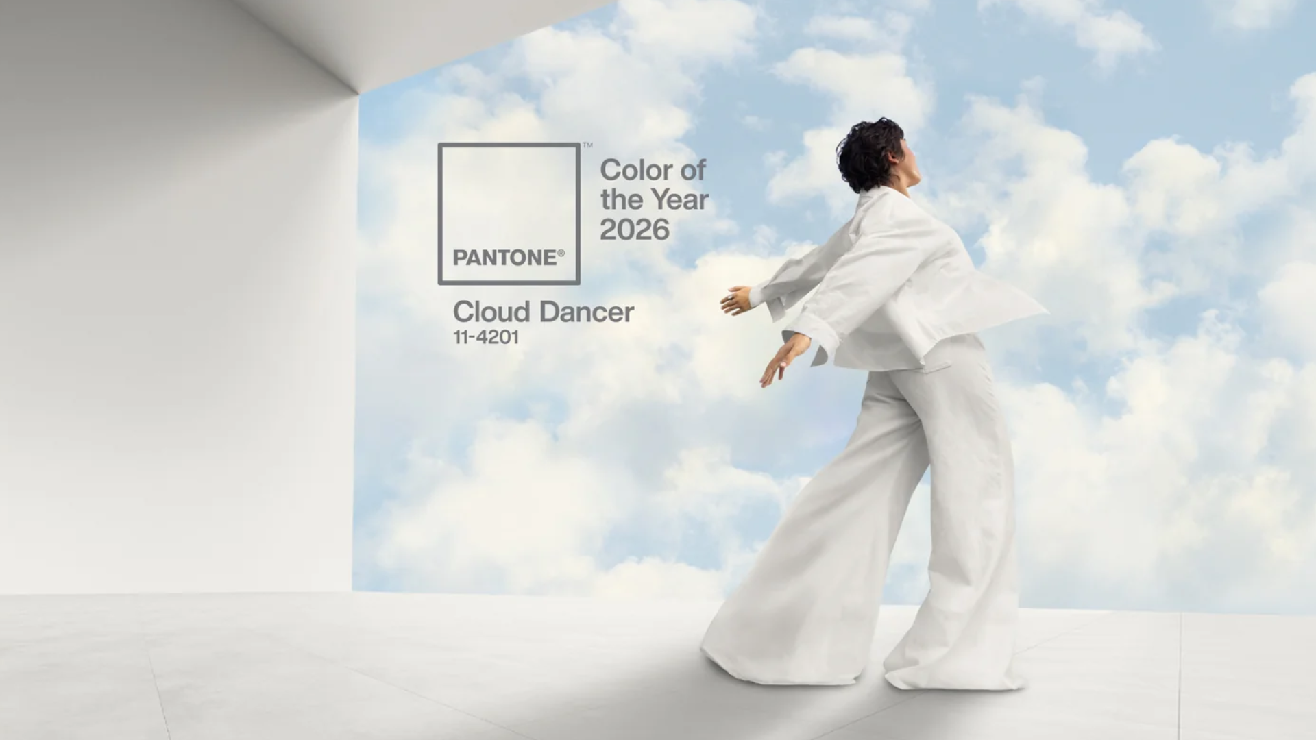
With the recent (and controversial) announcement of Cloud Dancer, the Pantone Color of the Year for 2026, we wouldn’t be surprised if you were thinking - well, what IS a Pantone colour and what does it mean?
Since the worldwide mainstream popularity of Pantone and its lifestyle brand, not many people know that Pantone actually first began as a commercial printing company for an advertising company. Before explaining what Pantone colours are though, we first need to go back in time to see how it all began.

Colour is powerful and the world’s most famous brands are built with colour combinations that become as iconic as the brands themselves. Good examples include the Coca Cola red, Cadbury purple, and Tiffany’s turquoise. With a global brand, you’ll naturally need to print materials in various countries and one of the challenges of commercial offset printing (before digital printing was pioneered and widespread) was the ability to print colours accurately and consistently when using different print suppliers.
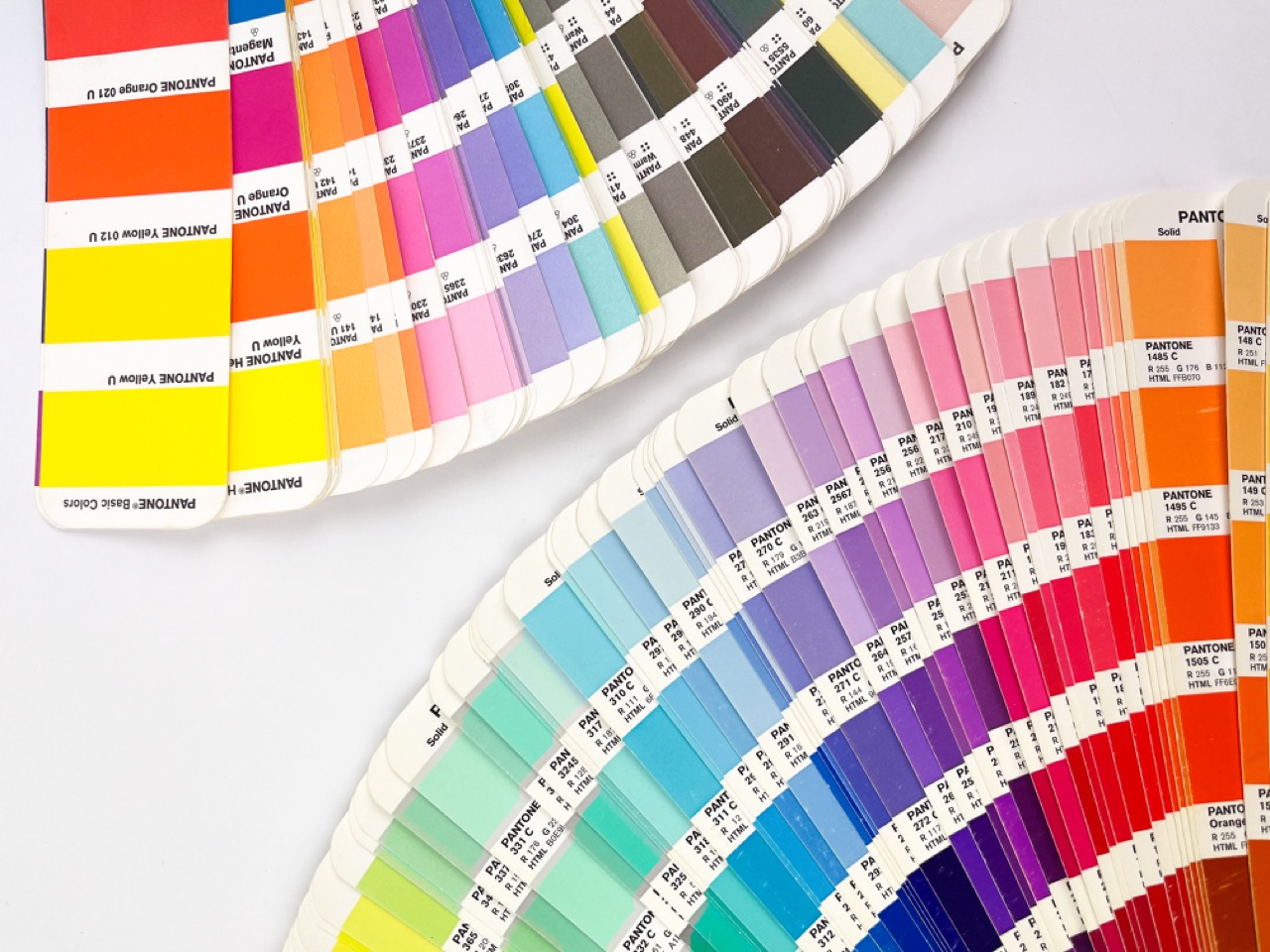
This is the idea that kickstarted the Pantone brand. In 1962, Lawrence Herbert, a recent university graduate working at the printing company, wanted to simplify the colour printing process. He started doing this by creating specific formulas for how they could produce their printing inks, which was then catalogued and launched as swatch books in 1963 for designers and printers to incorporate into their work.
These printing ink formulas and swatch books are what is now known as the PANTONE MATCHING SYSTEM® (also known as PMS), and basically made it easy for designers around the world to pick (or ‘colour-match’ different colours which could then be replicated and consistently printed, no matter the supplier or printing machine, across multiple print runs on paper or products, because each printer would use the same formula to achieve the desired colour.
The code or formulas for the pigments and inks used for printing are essentially what defines a Pantone colour. Pantone colours are the same colours we see everyday, simply standardised and translated into a language that can be applied worldwide for consistent reproduction.
This colour system became an industry standard and Pantone made sure that as the pioneer of this system, that they were the only one designers and printers could use by trademarking every single colour name, formula, code, number and visuals. Although you can’t copyright a colour, the naming convention and how you communicate how to recreate a colour can be. This is sort of like how you can’t copyright mathematics but someone can copyright a maths textbook.
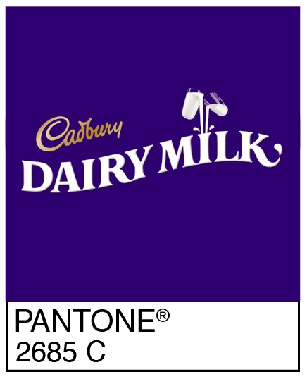
What this means is that anyone using any Pantone colours without owning a license or physical swatch book, is committing a trademark infringement, which the company doesn’t take lightly by being persistently litigious. This trademark approach caught on with bigger brands, and led to the trademarking of various brand colours within specific industries (a few complex legal battles too). A good example is Cadbury’s purple: if you’re starting your own chocolate brand in the UK, you cannot use the same Pantone colour (PMS 2685 C) as Cadbury—but you're starting a brand of car tyres or pharmaceuticals, you might not have an issue if another brand hasn't already trademarked that PMS colour already.
It sounds pretty simple when you consider that a designer and a printer need only buy a swatch book from Pantone to be able to print all the colours a business needs but buying a swatch book once doesn’t create a sustainable business. Which is likely why Pantone recommends that professionals purchase new swatch books annually, as they claim that the swatch colours in their books will yellow or change slightly over time.
Designers couldn’t afford to own old swatch books with inaccurate colours, in case the products they’re designing end up printing in the wrong colour depicted compared to the actual output decided by the colour’s formula. And Pantone has certainly capitalised on this by selling swatchbooks in various sets, of which there are now many, at increasingly high prices of $200-$300 each. Every year, they re-produce their small sets of colours such as metallics, pastels and neons, uncoated or coated paper varieties, but if you’re looking for the entire set, as many printers do, it will set you back thousands. The new edition of the Pantone library currently retails at full price for AU$3,585.00 excluding GST—a pretty major annual cost for a designer or printing business.
Pantone began and was created for printing products with manually mixed pigments and inks, which are still used to this day for offset printing. However, digital printing has become more common, more affordable and improved the accessibility to reproducing accurate colours, consistently as digital printing uses percentages of CMYK ink. CMYK stands for each of the inks used - Cyan, Magenta, Yellow and Key stands for Black (can also be referred to as registration). During the process of digital printing, each of these colours are layered on paper separately, in different percentages.
CMYK percentages are similar to the pigment formulas of PMS, without the trademark. As a commercial digital printer, we don’t really need to use PMS colours, because even if they’re used in the print file we receive, the PMS colours will be converted to CMYK anyway!
The use of CMYK in digital printing has quickly become the industry standard because it’s able to print so consistently across different printing machines. If you’ve got a printer at home that prints in colour, you’re already using and buying CMYK cartridges!
Initially, Pantone embraced this change in the printing industry by partnering up with Adobe to provide their entire suite of colours as digitised swatches in Adobe software to help designers confidently design on digital screens, knowing that the colours would be reproduced accurately in print. That is until Pantone changed their business model, causing a rift with Adobe, as their digital colour swatches became a subscription-only paid product in 2022.
Despite years of being available within Adobe software, designers and printers alike found any print file elements with PMS colours now shown in black until they paid for the new premium subscription service called Pantone Connect Premium. While their Pantone Connect website is free to sign-up, the Premium subscription is what enables you to actually use the colours across Adobe software, create colour palettes, access colour information and more—all of which is exclusive (non-included) if you buy a physical swatchbook. The subscription is currently priced at AU$138/year or $47.99/month per user, which is not the cheapest, especially for businesses who require single-sign on (SSO) which has an additional one-time cost of AU$5146.92.
Within the fashion industry, trends and seasonal fashion will generally appear in similar colour palettes year-in and year-out, and in 2000, this worldwide phenomenon gave Pantone the idea and the opportunity to solidify itself as the industry expert when it comes to colour. This is what began their annual ‘Color of the Year’ release; an announcement that now also includes celebratory events, merchandise and promotional activities for a specific Pantone colour as chosen by members of the Pantone Color Institute.
These colours have become a global forecast for what colours people are likely to use, choose or at least prefer within the greater cultural zeitgeist and across all industries of fashion and design in the following year. This strategic marketing move was meant to get designers talking about colour (likely in an effort to drive more sales of Pantone swatch books), but has effectively made the chosen Color of the Year a self-fulfilling prophecy because designers and brands would quickly jump onto using them for upcoming products following its announcement.
Pantone colours are simply the same colours you see and use everyday, standardised in a simple language so it can be reproduced across the globe for offset printing. Digital printing uses CMYK ink instead, so Pantone colours are automatically converted to CMYK anyway.
Pantone’s Color of the Year is a Pantone colour chosen by the Pantone Color Institute as a prediction (and often self-fulfilling prophecy) for which colour will trend and permeate across all industries in the next year.
Whether you like the chosen colour (Cloud Dancer) or not, shouldn’t affect your everyday life at all—especially if you’re looking to create products that are made with digital printing, a technology that continues to advance every year!
To learn more about our digital printing services and get started on your printing journey, get in touch with our team today. We're here to help you navigate the evolving world of printing with confidence.
Written by
Last Updated: