
Building An Author Profile As A Business with Saara Milliken
July 15, 2026
Explore the essential tips that'll elevate your next annual report print run for a lasting first impression!

An annual report isn’t just a record of a company’s achievements mixed in with a few financial statements. If your company is publicly listed, it’s an important reporting requirement that needs to contain specific documents and must be submitted to the Australian Securities Exchange (ASX) and any shareholders.
Creating a captivating annual report can be a big endeavour, especially when it’s compulsory for many Australian organisations and this doesn’t mean that it’s just about ticking boxes for your company’s reporting requirements. Rather, it's your chance to tell your organisation's story with clarity, professionalism, and a bit of creative flair to stakeholders, investors, clients , employees and even your local community. This is also why many smaller organisations still invest in a high quality printed annual report each year because regardless of who will be reading your annual report, the quality of your printed report speaks volumes about your brand before anyone even reads a word.
Mastering annual report printing means using a sound structure, understanding design principles, choosing materials that'll make your report shine, and ensuring your layout actually enhances readability rather than hindering it. In this guide, we'll explore the essential tips that'll elevate your report from "yep, that's a report" to "wow, look at our company go!" whilst ensuring it conveys the vital information you need it to and makes a lasting impression at the same time. These strategies will help you achieve professional results that genuinely reflect your brand's integrity and ambition, so let's dive in!
Like any coherent and cohesive book, an effective annual report needs solid bones aka, a logical framework that guides readers through your story without them getting lost or bored. Putting together information for a book can be as easy as dumping information on a page, but that’s as long as you dump the right information, in the right spots and in the right order.
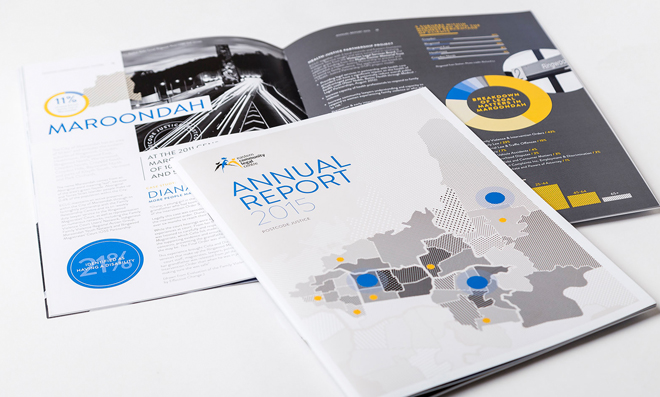
A great start is to kick off your annual report with a compelling cover that features your company name, logo, report title, and the period for which you’ll be reporting on. The best thing about covers is that it’s not the place to be shy, but instead it sets the tone for the entire publication. A striking cover design will capture attention, draw readers in and create anticipation for what's inside, sort of like how a storefront window will beckon you inside. Then a matching title page is the perfect segue into the document and continues the theme you’ve already set from the cover itself.
After laying out the full structure of the report in the table of contents, most annual reports next include a letter from the CEO or chairman, as it acts as a shorter, personal introduction to the document and provides a crucial personal touch and connects leadership with whoever is reading the report. This is especially great if the report will be read by stakeholders. This section usually addresses your company's achievements, challenges faced throughout the year, and the strategic direction moving forward. The tone should feel authentic and reflective, not your typical corporate waffle, because it’s meant to build confidence in your management whilst honestly acknowledging both wins and areas that need work.
An executive summary (or Abstract if you tend to read scientific studies), acts as a snapshot or roadmap, that provides a high-level overview of key findings and messages. Try to keep it concise yet comprehensive, by highlighting the most critical information in an easily digestible format. Basically like a TLDR version to encourage people to keep reading.
This section is pretty self-explanatory in that it’s all about introducing and gently leading readers into the heart of the report’s contents, and it’s also where you can be the most creative. It doesn’t need to be a single standard paragraph that explains the purpose of the report or a regurgitation of your company’s credentials or website ‘About’ page either. We think it’s the perfect space to reframe the business based on what’s happened in the last year, and connect any key contextual information relevant to the report’s findings. Many organisations also use these sections to expand on the executive summary with photos, stories and visualisations to present highlights from the past year with a personal touch. Many companies also position this section as a Management Discussion and Analysis (MD&A), which goes into detail on all the factors affecting the business, to help stakeholders understand the strategic decisions being made. This is usually a section full of comprehensive data including economic environment and industry trends, risks, opportunities and specific challenges the company has been and continues to face as of the report’s release.
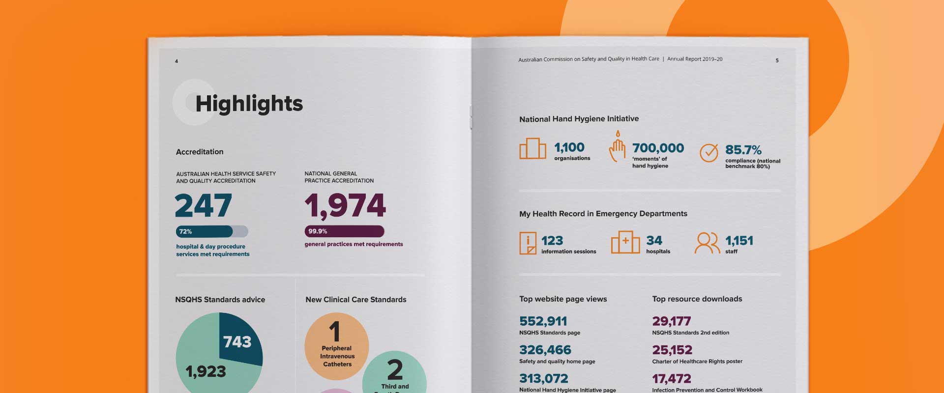
This component of the report is often overwhelming but is truly the most important when it comes to compliance if your annual report is compulsory. The financial statements section usually deserves attention in particular because this is where you present the numbers that matter most to your stakeholders. The report’s financials such as the balance sheets, income statement and cash flow statements are all crucial for presenting key metrics such as revenue, profit, and earnings per share and should be prominently displayed using clear charts and graphs. Including year-over-year comparisons provides essential context and helps readers understand performance trends at a glance. No one wants to squint at dense tables of figures!
A business performance review should delve deeper into operations, discussing key projects, market developments, and strategic initiatives. This section benefits from a balanced approach, by both celebrating your wins whilst honestly addressing challenges. Consider including case studies or success stories that illustrate your company's real-world impact and bring your narrative to life, as people connect better with stories, not statistics alone. One way to add more context to insights and statistics is by using footnotes. These are handy because the reader can decide if they’d like further information on a specific statistic or insight, without interrupting the flow of the report.
One of the additional sections that can strengthen your annual report is one on corporate governance and compliance. These shouldn’t be overlooked as they demonstrate your commitment to transparency and responsible business practices, something that’s increasingly important in today's business landscape. Other additional sections in an annual report include sustainability or corporate social responsibility reports, and audit reports by external parties, which can support the accuracy and fairness of all the information you’ve set out in the report for greater credibility.
Finally, it’s important to summarise key findings and conclude with a future outlook. This helps readers feel like they have been given the complete picture from all the information within the report. Outlining your strategic priorities and growth plans is also great for giving stakeholders confidence in where you're headed!

Good design isn't about making things look pretty (though that helps). It's actually about making information accessible and engaging whilst reinforcing your brand identity throughout the document.
Colour plays a pivotal role in annual report design, influencing both aesthetic appeal and readability. A well-chosen colour palette reinforces your company's brand identity and creates visual cohesion. Use colours consistently throughout—applying them to headings, subheadings, charts, and graphs creates a unified look that feels both professional and memorable. However, aesthetics must never compromise functionality. Ensure sufficient contrast between text and background colours, particularly for lengthy sections. Poor contrast fatigues readers and reduces comprehension, which rather defeats the purpose of having an annual report in the first place. Typography deserves just as much consideration. A combination of serif and sans-serif fonts creates balance, where typically, serif fonts work well for body text whilst sans-serif fonts suit headings and captions. Maintain consistency in font sizes and styles to create hierarchy and guide readers through your content naturally.
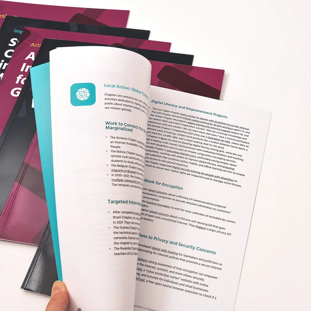
Your layout should feel clean and organised, with ample white space preventing the report from feeling cluttered or overwhelming. Using a range of media, from photos, illustrations, visualisations and graphs is especially great for a modern annual report and helping to break up your content. Strategic placement of media such as photographs of key events, team members, or products will break up text and make your report more engaging. Incorporating infographics and data visualisations transforms complex information into easily digestible formats. Infographics can simplify data, highlight trends, and make comparisons more apparent, helping readers quickly grasp key messages. When designing these elements, focus on clarity and accuracy first and foremost. Your visual representation needs to faithfully reflect the underlying data, not just look fancy.
Although we, of course, recommend getting your annual report printed because nothing beats a physical, professional printed annual report for maximum impact with stakeholders, it is also worth making your report design digital-friendly. Not only is this good for accessibility because you can easily share the report online and on your website, but it gives you the opportunity to add engaging interactive elements such as videos and animations.
Selecting the right paper stock is one of those decisions that can significantly impact how your annual report feels in the hand and how it's perceived. The paper you choose should reflect the quality and professionalism you want to convey. It's a tactile experience that creates an immediate impression, after all.
The most common annual report size in Australia is A4 (210mm x 297mm), as its dimensions are widely recognised and compatible with standard printing and binding equipment, and helps keep costs reasonable. Whilst non-standard sizes can give your report a unique look and help it stand out, they may increase costs due to special paper requirements and additional printing considerations. Choose wisely based on your budget and the impression you want to create.
For a typical professional annual report, we often have printing customers choose an A4-sized PUR perfect bound book with a 4-page cover on 200-300gsm gloss or silk stock and text pages on 100-150gsm gloss or silk. This configuration offers an excellent balance of quality, durability, and cost-effectiveness. The heavier cover stock provides a premium feel whilst the lighter interior pages keep the report comfortable to hold and reduces the overall weight of the book (great for lowering shipping costs if you're distributing hundreds of reports).
Paper finishes range from matte to gloss, each offering distinct advantages. Gloss paper enhances the vibrancy of colours and images, making photography and graphics pop. Matte paper, on the other hand, provides a more sophisticated and subdued appearance that's easier to read under various lighting conditions. Silk is also a good option if you’d like a happy medium. Consider what the bulk of your content looks like when making a choice, as reports heavy with photography and colourful graphics benefit from glossier finishes, whilst text-focused reports often suit matte stocks better.
Although we see silk or gloss stock ordered for annual reports more often, uncoated paper is trending and on the rise for annual reports. This is especially true for organisations looking for a more tactile, authentic experience, because uncoated papers offer a natural feel that's particularly effective for reports emphasising environmental responsibility and authenticity. Some companies opt for uncoated stocks throughout, creating a professional, tactile annual report that stands apart from typical glossy publications. In the end though, it's all about matching the medium to the message.
Your choice of binding method affects both the functionality and appearance of your annual report. Different methods will suit different page counts, budgets, and aesthetic preferences because there's no one-size-fits-all solution here.
Saddle stitching (stapling at the centre fold) is an economical choice for reports with up to 40 pages. It provides a clean, simple finish and allows the report to lay relatively flat when opened. This isn’t as common for annual reports, but it’s perfect for shorter reports or those on a tighter budget.
Perfect binding is the most popular choice for annual reports and offers a polished, professional appearance. This method creates a flat spine where you can add text, great for including the year and company name for easy shelf identification. Perfect binding gives your report the appearance and feel of a professionally published book, which is exactly what you're after.
Spiral and comb binding are alternatives that allow reports to lay completely flat and fold back on themselves, making them easier to reference during meetings. Whilst less formal than perfect binding, these are especially good for working documents that require frequent consultation. They're practical, even if they don't scream prestige.
For premium reports where cost isn't the primary concern, consider case binding (or hardcover binding). This provides maximum durability and prestige, signalling the importance of your report and creating a lasting impression. It's the luxury car of binding methods, and although it’s not for everyone, it’s truly impressive when done right.
Special printing finishes can add elegance and distinction to your annual report, but use them judiciously. The most common finishes we see for report covers are to add durability and/or visual impact such as gloss or matte lamination, spot UV (to add a glossy layer) or foiling to specific graphics, logos or images. These finishes add a tactile dimension that engages readers and draws attention to strategic elements. They’re all quite subtle but effective, and really says "we care about the details."
Too many special effects can overwhelm readers and undermine professionalism, making your report look like you've thrown everything at it hoping something sticks. So we always recommend selecting one or two finishes that align with your brand and apply them strategically for maximum impact.
Sustainability has shifted from "nice to have" to "must have" in annual report printing. Many organisations now have formal sustainability goals requiring the use of environmentally responsible materials and processes. For these companies, sustainable printing isn't optional; it's a necessity that demonstrates alignment between stated values and actual practices. And let's be honest, stakeholders are watching.
The Forest Stewardship Council (FSC) is a non-profit organisation established in 1993 that promotes responsible management of the world's forests through certification. When you see the FSC logo on paper products, it guarantees the material comes from responsibly managed forests that provide environmental, social, and economic benefits.
FSC certification includes three primary labels: FSC 100% (all materials from FSC-certified forests), FSC Recycled (100% recycled materials), and FSC Mix (a combination of FSC-certified materials, recycled content, or controlled wood). Each serves different sustainability goals whilst ensuring responsible sourcing. The beauty of this system is its flexibility, because you can choose your annual report’s paper based on the certification level that aligns with your environmental commitments and budget.
Our paper range includes many FSC-certified paper stocks, both mixed and 100% recycled paper stocks. It’s also worth noting paper can typically be recycled five to seven times before fibres degrade and become unusable. This means recycled paper often contains some virgin fibre to maintain quality. Choosing FSC Recycled or FSC Mix papers ensures that any virgin content has been responsibly sourced, maximising environmental benefits whilst maintaining the print quality you need.
Some paper mills now offer carbon neutral printing programs where emissions from manufacturing and distribution are offset through verified environmental projects. Certain paper stocks in our paper range are automatically carbon neutral, with manufacturers offsetting direct emissions through contributions to forest conservation projects. When you're committed to sustainability, partnering with printers who share the same values makes the entire process smoother and ensures your annual report truly reflects your environmental commitments from start to finish.
Even well-intentioned annual report projects can have hiccups due to preventable mistakes. A few common pitfalls you can avoid to save you time, money, and a fair bit of stress include:
Creating a stunning and professional annual report requires thoughtful attention to design, content, and printing execution. With a sound structure, consistent design elements and the appropriate print configurations, your annual report can easily convey all the vital information you need while also engaging and captivating whoever is reading it.
Choosing appropriate paper specifications, binding methods, and finishing techniques adds that cherry on top so that when it’s fresh off the press, your physical report can accurately reflect your organisation's quality and professionalism. A well-crafted annual report becomes a powerful tool for communicating your organisation's achievements and future potential in the best possible light.
If you’re looking for a print provider to bring your annual report to life with high quality commercial book printing, give us a shout by requesting a quote or getting in touch online today.
Written by
Last Updated: